
Most people dislike status reports. Developers see them as unnecessary tasks that show activity, not real progress. Stakeholders usually skim them. Project managers spend hours on updates that seem to disappear without impact.
According to a 2018 Workfront survey, 57% of workers spend most of their day on busywork rather than strategic tasks, and status reporting often tops that list. Teams believe they could be 60% more productive if they could eliminate these low-value activities.
But here's the thing: the problem isn't status reports themselves. It's how we create them.
A well-crafted status report is a leadership tool that surfaces issues early, flags project risks before they compound, and aligns teams before problems spiral. For project managers in agencies and professional services firms, this separates reactive problem-solving from proactive project leadership.
According to 2024 PMI research, high-performing organisations complete 90% or more of projects on time, on budget, and to scope—and effective status reporting is a defining characteristic of these teams. Meanwhile, 78% of projects still experience budget overruns or timeline delays, often because risks weren't surfaced early enough.
This guide explains how to write a project status report that drives decision-making. You'll get real examples, advanced tips, agency-specific insights, and a framework to transform reporting from overhead into a strategic advantage.
Before diving into what makes a great status report, let's address why most fail. Understanding these patterns helps you avoid traps that make reporting feel like wasted effort.
Most status reports are task lists disguised as project updates. "Task A is 50% complete. Task B is delayed." This tells stakeholders what's being done, but not whether the project is on track to achieve its goals.
The fix: Focus on outcomes and decisions needed. Instead of "Completed 12 of 20 design mockups," report "Design phase tracking 4 days behind due to client feedback cycles. Recommend scheduling approval deadline to prevent launch delay."
When a project is struggling, reports often use vague language: "Some challenges encountered," "Minor delays expected," or "Progressing as well as can be expected." This protects the PM but leaves stakeholders unprepared for reality.
According to Wellingtone's 2024 report, only 48% of organisations consistently baseline their schedules, making it nearly impossible to show accurate planned vs. actual performance. Without honest deviation reporting, budget overruns and timeline slips aren't caught until it's too late.
The fix: Use clear status indicators (Green/Yellow/Red), specific metrics, and explicit escalations. If you're red, say you're red—and explain what you need to fix it.
If you're spending 2-3 hours compiling status from multiple tools, Slack threads, and email updates, your process is broken. This is why 57% of workers feel they spend most of their time on busywork.
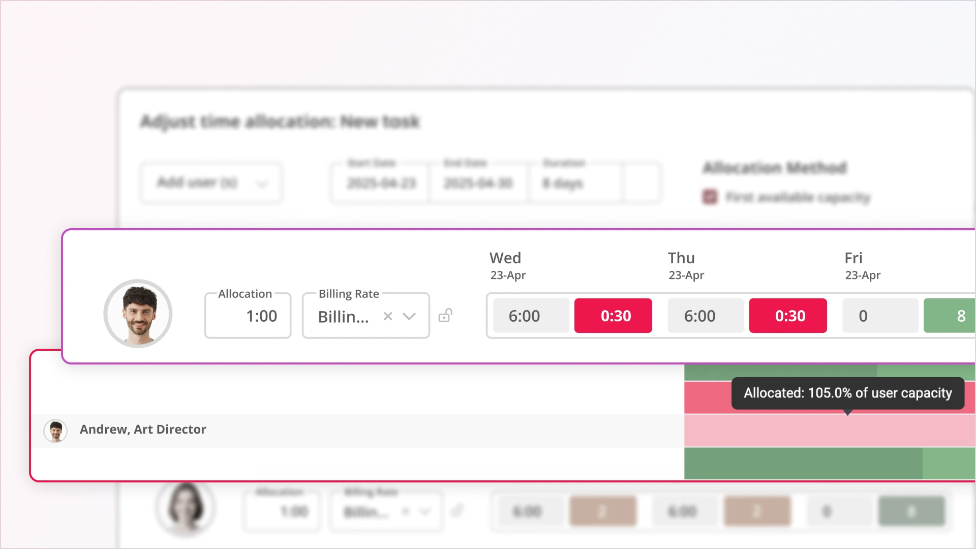
The fix: Automate data pulls from your project management system. Tools like Magnetic auto-sync time logs, budget variance, and milestone progress—turning a 3-hour manual exercise into a 15-minute review-and-send.
Be honest: when was the last time a stakeholder replied to your status report with questions or decisions? If reports go unanswered, they're likely too long, too detailed, or too boring.
The fix: Lead with a decision-focused executive summary. Put the "What needs your attention" section at the top. Make it scannable with visuals. Save the detailed metrics for those who want to dig deeper.
Traditional status reports are autopsies: they tell you what happened last week. But stakeholders need to know what's coming and what decisions are needed to stay on track.
The fix: Always include a forward view (next 2-4 weeks), dependency blockers, and required decisions. This transforms reports from historical documents into strategic planning tools
A project status report is a structured document that communicates project health, surfaces risks early, and drives stakeholder decisions by combining delivery milestones, financial data, resource insights, and forward-looking forecasts into a comprehensive view that enables proactive course correction.
Unlike simple progress updates that just list completed tasks, effective status reports answer three critical questions:
A project status report typically includes:
A good status report highlights what needs attention now, not just what happened. It gives stakeholders clarity, flags risks early, and helps everyone stay focused on what will make or break the next phase.
The Real Role of a Status Report in Project Leadership
Most project managers are stuck writing status reports treated like homework: completed out of obligation, skimmed by clients, and filed away with little consequence. But when done right, status reports serve as the heartbeat of a project, providing a real-time pulse on delivery, finance, and risk to help everyone move faster and make better decisions.
Apart from filling in a template, the goal of a status report is to answer the question every stakeholder secretly wants answers to:
"Are we still on track, and if not, what are we doing about it?"
If your report doesn't answer that, it's not doing its job.
Let's move past checklists and generic "project update" language. Here's what best-in-class status reports from agencies, consulting firms, and in-house teams include.
A good report shows progress. A great report shows deviations.
Include a structured breakdown like this:
Measuring planned vs. actual performance tells the story of whether the project is accelerating, evolving, or burning through budget ahead of schedule. Tools like Magnetic present this data live in one view, so Project Managers aren't scrambling to compile reports from five spreadsheets.
People issues are often where delivery bottlenecks begin, especially in professional services firms where billable utilisation directly impacts profitability. Status reports should include insights into:
Resource Load Chart:
Design: 🔴 Overloaded (118% capacity)
Development: 🟠 Near capacity (88%)
Strategy: 🟢 Underutilised (52%)
Agency Example: A creative agency running multiple client campaigns simultaneously discovered through their weekly status report that their senior design lead was allocated at 118% capacity across three overlapping projects. Meanwhile, two mid-level designers sat at 52% utilisation due to poor task distribution. The status report surfaced this imbalance before burnout or missed deadlines occurred, allowing the Operations Director to rebalance work and prevent a $35K revenue loss from potential scope cuts.
Magnetic's Team Scheduler tracks resource capacity vs. actuals, making it easy to present this without making educated guesses or Slack pings.
Most status reports feature a "risk section" that looks like a bland list:
This is not useful.
According to Wellingtone's 2024 report, only 64% of project managers consistently engage in risk management, leaving over a third of projects exposed to preventable setbacks. Your status report should close this gap.
Instead, status reports should call out leading indicators:
Each signal should include a short mitigation plan and a confidence rating (Green / Yellow / Red). Your report should predict problems, not just report them after the fact.
Real-World Agency Scenario:
A digital consultancy was reporting "green" status on a website redesign project, tasks were being completed, and the client seemed happy, but their status report included a leading indicator: rework rates had increased 28% over the past two weeks.
Digging deeper, the PM discovered the client was providing inconsistent feedback across different stakeholders. By surfacing this pattern early through the status report, they were able to schedule an alignment meeting, establish a single point of approval, and prevent what would have become a scope-creep disaster, adding 40+ un-billed hours.
Project managers often avoid financial reporting, assuming it's the finance team's job. But here's the reality: 78% of projects experience budget overruns or timeline delays (2024 industry data). By the time finance notices the problem, you've already burned through your buffer.
For agencies and professional services firms, financial health indicators in status reports are not optional. They help you prevent over-servicing, protect margins, and catch profitability issues before they compound.
Burn rate is the actual spending rate relative to the planned spending. If you're burning budget faster than planned delivery, you're either ahead of schedule (rare) or bleeding money (common).
How to report it:
"Current burn rate: $42K/week vs. planned $38K/week (+10.5%). At the current pace, the budget will be exhausted 2.3 weeks before scheduled completion."
Why this matters: Catches overservicing early. If you're 40% through the timeline but 55% through the budget, you have a problem that needs immediate attention.
EAC projects your final project cost based on current performance. It answers the question: "Given how things are going, what will this project actually cost?"
Formula: Budget at Completion ÷ Cost Performance Index (CPI)
Example: If your approved budget is $500K and your CPI is 0.85 (you're getting $0.85 of value per dollar spent), your EAC is $588K—you're headed for an $88K overrun.
How to report it:
"Approved Budget: $500K | Current EAC: $523K (+4.6% overrun projected). Primary driver: design rework cycles averaging 2.3 iterations vs. planned 1.5."
For client-facing projects, this reveals whether your team is working on productive client deliverables or getting stuck in internal meetings, rework, and admin.
Target ratio: 75-80% billable in most agencies.
Warning threshold: Below 70% indicates inefficiency or scope creep.
How to report it:
"Team billable ratio this week: 68% (below 75% target). Primary causes: extended internal planning meetings (12 hrs) and QA rework (18 hrs). Action: Streamlining approval process to reduce rework cycles."
Agency Profitability Example:
A boutique consultancy tracked their billable ratio at 68%—below their 75% target—for three consecutive weeks. Their status report broke down the 32% non-billable time:
By reporting these specific drivers, not just the overall ratio, leadership could take targeted action: they implemented a brief template to reduce meeting time and added a requirements review gate to prevent rework. Within 4 weeks, the billable ratio recovered to 76%.
Your margin is profit. If you planned for 35% margin but you're tracking at 22%, the project is less profitable than expected, even if the client is happy.
How to calculate: (Revenue - Actual Costs) ÷ Revenue
How to report it:
"Current actual margin: 28% vs. planned 35% (-7 points). Driver: Higher-than-planned senior resource allocation (40 hrs at $175/hr vs. budgeted mid-level at $125/hr)."
This shows whether your team is over- or under-allocated. High utilisation over 90% leads to burnout and missed deadlines. Low utilisation under 65% means you are paying for bench time.
Healthy range: 70-85%
How to report it:
"Development team utilisation: 94% (above sustainable threshold). Recommendation: Delay Phase 3 start by 1 week to prevent team burnout."
Interpretation: Project is trending toward a cost overrun, driven by a low billable ratio (too much rework) and unsustainably high utilisation (team stretched thin). Immediate action is required to reduce non-billable time and adjust resource allocation.
Why Financial Transparency Builds Trust
Including commercial metrics signals to stakeholders that you're managing the business, not just the tasks. Operations Directors and agency owners expect to see these numbers; when they're missing, they assume you're either unaware or hiding problems.
Tools like Magnetic surface automatically pull these metrics from time logs, budget allocations, and resource schedules to eliminate manual calculation. What used to take an hour of spreadsheet work now takes 30 seconds of dashboard review.
If you're spending 2-3 hours every week manually compiling status reports, you're working too hard. The biggest shift in project reporting over the past few years is not what goes in reports, but how reports get created.
According to 2024 research, teams using real-time project tracking tools saw a 20% reduction in schedule deviations. But the more immediate benefit? Modern reporting platforms reduce report preparation time by up to 40% by eliminating manual data aggregation.
Magnetic was built to eliminate the reporting scramble. Here's what happens automatically:
The table shows where reporting time actually goes: pulling data from different systems, chasing updates, and rebuilding the same view every week. Automation removes that layer entirely, so reporting becomes a quick review of what’s already up to date.
Not all project management tools are created equal. When evaluating automation capabilities, prioritise:
Let's do the math:
If you manage 5 projects simultaneously, that's 645 hours/year freed up for strategic work instead of data compilation. At a fully-loaded PM rate of $125/hour, that's $80,625 in reclaimed capacity.
Beyond time, the real value is accuracy, consistency, and the ability to spot problems before they become crises.
Milestones are meaningless without context. Instead of just a timeline with dates, show:
This is the most underutilised section in most status reports and the most valuable to leadership. While task updates inform, decisions and escalations require action. This is where your report transforms from a passive update into an active project management tool.
According to a 2024 study, 55% of team members cite unclear project objectives as a major hurdle. The decisions and escalations sections cut through ambiguity by explicitly stating which choices need to be made and by whom.
Weak decision requests look like this:
"We need to decide on the homepage design direction."
Strong decision requests include:
Example - Strong Decision Format:
🔶 DECISION REQUIRED: Homepage Hero Section Approach
Decision: Choose between full-width video background vs. static image with animation overlay
Why this matters: Impacts development timeline (video adds 5 days) and affects site performance (video increases load time by 1.8 seconds)
Options:
Recommendation: Option C (hybrid approach) balances brand impact with performance requirements
Decision needed by: EOD Thursday to maintain launch date
Decision maker: CMO in consultation with UX Lead
Escalations are different from decisions. They're blockers that require higher-level intervention to resolve. Not every problem is an escalation. Use this test:
Escalate when:
Don't escalate when:
Example - Effective Escalation Format:
🔺 ESCALATION: Legal Review Bottleneck Threatening Launch
Issue: Legal review has been blocking media asset handoff for 6 business days (since 1/15)
Impact:
What we've tried:
What's needed:
Recommended action: Operations Director escalate to procurement sponsor today with request for 24-hour turnaround commitment
Owner: [Ops Director name]
Creating Urgency Without Creating Panic
The goal of decisions and escalations sections is to drive action, not alarm stakeholders. Use calibrated language:
For Decisions:
For Escalations:
Why This Section Gets Results
When you isolate decisions and escalations in a dedicated, formatted section with clear owners and deadlines, stakeholders can't ignore them. It shifts the dynamic from "just keeping you informed" to "these items require your action."
In one agency's analysis, adding a structured Decisions & Escalations section to their weekly status reports reduced decision cycle time by 40% because stakeholders could quickly scan for items requiring their input rather than hunting through paragraphs of narrative.
Most status reports are autopsies. They tell you what happened last week. But stakeholders do not just want to know where you have been; they want to know where you are going and what could derail you.
The forward view is your opportunity to be predictive, not just reactive. Research shows that teams using predictive intelligence in their reporting experience 20% fewer schedule deviations because they catch problems before they materialise.
What are the 3-5 tasks that, if delayed, push the overall delivery date? These get priority attention.
Example:
Critical Path - Next 2 Weeks:
What external factors are you waiting on? Who do you need inputs from? What could become a blocker?
Example:
Key Dependencies:
When do specific decisions need to be made to avoid downstream delays?
Example:
Upcoming Decision Points:
What are you monitoring that isn't a problem yet but could become one?
Example:
Watching Closely:
Who's needed when? Any capacity constraints upcoming?
Example:
Resource Allocation - Next 3 Weeks:
Mitigation for dev overload: Pulling in contractor for 20 hours to handle non-critical items, protecting core team focus on critical path.
Instead of just listing what's next, connect it to outcomes:
Next 2 Weeks: What Success Looks Like
By end of day Friday 1/26, we will have:
To achieve this, we need:
The best forward views inform, assign ownership and create accountability.
This table format makes it immediately clear what's on track, what needs attention, and who's responsible.
When stakeholders can see what's coming and what you need from them, they can plan their own work accordingly. Instead of being surprised by a last-minute "we need your approval tomorrow," they know three weeks in advance that their input is coming.
The forward view transforms status reports from historical records into strategic planning documents. That is where they become genuinely useful.
Magnetic was built to eliminate the reporting scramble. It pulls real-time data from time logs, task progress, budget allocations, and resourcing schedules—then helps you assemble boardroom-ready updates without the spreadsheets.
Teams using real-time project tracking tools in 2024 saw a 20% reduction in schedule deviations (Workamajig). Dashboards and visual charts enhance stakeholder engagement by 25% compared to text-only reports (ClearPoint Strategy).
You can:
Ask yourself: “Will this report help someone make a decision?” If not, you’re likely reporting on activity and not insights. A useful report drives both clarity and action.
.svg)
Delta from baseline. Too many reports show current status without showing how far off we are from the original plan (in timeline, budget, or resources). That delta is often the early signal of larger project failure.
For high-impact client projects: weekly. For longer-term internal initiatives: biweekly may be sufficient. The cadence should match the project’s risk and pace - projects with shorter deadlines need tighter communication loops.
Use layered communication. Email for summary, linked PDF for visuals, and dashboards for live data. Clients and execs consume info differently - meet them where they are.
Systemise what doesn’t need human input. Build a standard structure, automate data pulls (e.g. from Magnetic), and create templates for common report formats. Your time should be spent on interpretation, not compilation.
Be honest, be specific, and lead with your mitigation plan. Weak approach: "The project is experiencing some challenges and may be slightly delayed." Strong approach: "The project is red. We're 12 days behind schedule due to delayed client approvals (8 days) and unplanned technical complexity (4 days). Here's the mitigation plan: [specific actions]. Timeline impact: launch moves from 2/15 to 2/27 unless we get approvals by EOD Friday." Stakeholders respect honesty paired with action. What they don't respect is sugar-coating problems until they explode. Remember: your status report's job isn't to make the project look good—it's to give stakeholders the information they need to make good decisions.

Magnetic is an all-in-one workflow management platform designed and built for professional services firms.


.svg)