"Without data, you're just another person with an opinion." – W. Edwards Deming
Every CEO has gut instincts, but instincts without data are just educated guesses. And in business, guessing isn’t a strategy – it’s a gamble. The difference between a CEO who steers the company with confidence and one who is constantly having to put out fires comes down to tracking the right metrics at the right time.
Waiting for monthly or quarterly reports often means reacting too late. But a weekly check-in on key numbers gives you the power to catch problems early, adjust when you need to, and keep your business moving in the right direction.
To make sense of all the data, we’ll be using the LEMA approach throughout this guide:
This article will break down the five key metrics every CEO should track weekly and show you exactly how to turn those numbers into real business impact without drowning in spreadsheets.
Most CEOs check their numbers, but many do it too late. By the time a monthly or quarterly report lands on their desk, a small issue has often snowballed into a serious problem. Tracking relevant business metrics weekly is a best practice amongst CEOs to remain competitive and achieve sustainable growth. A dip in revenue, a cash flow crunch, or an underutilised team is much easier to fix before it spirals out of control. That’s where weekly tracking makes all the difference, supporting the financial health of the business.
Think of weekly tracking as an early warning system. It gives you real-time visibility into the numbers that drive your business, helping you spot trends and take action before they become costly mistakes. If a project is running over budget, a weekly review lets you course-correct immediately rather than realising too late that profitability has taken a hit.
A Harvard Business Review study (cited on Future Learn) found that companies that make data-driven decisions are 5% more productive and 6% more profitable than those that don’t. The advantage isn’t just in having the data – it’s in looking at it often enough to use it effectively. Data-driven decision making is essential for CEOs to navigate the complex business environments and allows them to make strategic decisions that drive business success. Using the right metrics can support more innovative strategies and improved outcomes for your company.
Professional service firms and agencies don’t sell products – they sell time. Every wasted hour, un-billed project, or slow-moving deal is money left on the table. The problem? Demand changes constantly. A single bad week can set a firm back significantly, and by the time monthly reports highlight the issue, there’s little that can be done to recover lost revenue. That's why maintaining operational efficiency and closely monitoring variable costs are critical for service firms to optimise resource allocation and sustain profitability.
For example, if billable hours drop one week, a CEO reviewing the numbers on Friday can take immediate action – adjust workloads, push for quicker approvals, or rebalance the team. But if they only check it monthly, the damage is already done.
Let’s say a consulting firm only reviews its sales pipeline at the end of each month. In theory, things look fine – a healthy number of proposals have been sent. But when they finally analyse their numbers, they realise deals have been stalling for weeks, and prospects have gone ice cold. Had they tracked this earlier, they could have made it right long before all that revenue was lost.
The takeaway? A simple weekly check-in would have prevented them from missing out on work they had already invested time in securing. Tracking sales pipeline metrics weekly helps measure progress, ensuring advancement is monitored and missed opportunities are avoided.
A week is long enough to spot meaningful trends but short enough to react quickly. Whether it’s adjusting projects, keeping an eye on cash flow, or making sure sales stay on track, weekly tracking lets you fix small problems before they become expensive ones.
Gross margin tells you how much money is left after covering direct costs – a straightforward way to see if your business is making enough to stay afloat. Gross profit margin is a key indicator of operational efficiency and profitability, andfocuses on the direct relationship between revenue and direct costs of production or service delivery. This metric is critical for evaluating the sustainability of your business model, because it reflects how well your core operations generate profit.
A healthy margin signals strong pricing, effective cost management and a project that makes commercial sense. If this number begins declining, its a sign that something is off- perhaps projects are taking to long, costs are increasing or pricing needs a rework.
The basic formula for calculating gross margin:
Gross Margin Calculation: Revenue - Cost of Goods Sold) ÷ Revenue x 100
Another important metric is operating profit margin, which assesses how efficiently a company manages its core business operation relative to sales.
For service businesses, "cost of goods sold" includes salaries, contractor fees and direct project expenses. You can track this in a spreadsheet, but if you’re juggling multiple projects, a dashboard like Magnetic’s profitability tracker makes life easier by pulling everything into one place.
A 20-person engineering firm noticed their gross margin was dropping. A quick weekly review showed that junior engineers were logging too many unbillable hours on admin work. By adjusting project roles and refining billing rates, they boosted their profitability by 8% within three months – without adding extra clients.
Cash flow is what keeps the lights on. It’s the difference between what’s coming in and what’s going out – and if you run out of cash, it doesn’t matter how profitable you are on paper.
Many firms only realise they have a cash problem when it’s too late. A weekly review ensures you catch trouble early and keep operations running smoothly.
How to measure it cash flow health:
Net Cash Flow Calculation: Cash inflows - cash outflows
Tracking "free cash flow" is also crucial since it serves as a key indicator of a businesses ability to generate and sustain value helps build and understanding of the businesses overall financial strength and ability to sustain itself long-term.
Track it in a weekly cash flow statement or use an automated tool like Magnetic, which flags potential cash shortfalls in advance. Set up alerts for unpaid invoices and keep a rolling four-week forecast to avoid nasty surprises.
A mid-sized architecture firm was constantly struggling with cash flow, even though they were profitable. A weekly review showed that supplier payments were going out before client invoices were being settled. By renegotiating terms and aligning payment cycles, they stabilised their cash flow without cutting costs.
For service businesses, the biggest asset is time – and billable utilisation measures how much of it actually gets paid for. Employee productivity is also a key performance indicator that measures how effectively the workforce contributes to business objectives.
How to measure Billable Utilisation:
Billable Utilisation (%): (Billable Hours ÷ Total Available Hours) x 100
A low utilisation rate means too much time is being wasted on non-revenue tasks. Fixing it means higher revenue without hiring more people.
How to track Utilisation:
Use timesheet software or project management tools to monitor billable hours. Best practices:
A mid-sized marketing agency had a utilisation rate of 65%, meaning 35% of their time wasn’t earning money. A weekly review showed that staff were overloaded with internal meetings and admin work. By streamlining meeting schedules and automating reporting, they raised billable utilisation to 75% – which translated to an extra €200,000 in annual revenue without adding staff.
Sales pipeline velocity tells you how quickly deals move through your pipeline. A slow pipeline indicates delayed revenue and unpredictable cash flow. An efficient sales process and effective customer acquisition strategies are key to maintaining pipeline health and supporting sustainable growth.
How to measure Sales Pipeline Velocity:
Pipeline Velocity = (Number of Deals x Average Deal Value x Win Rate) ÷ Sales Cycle Length
If this number drops, it means leads aren’t converting fast enough, and future revenue could be at risk.
How to track it pipeline velocity:
Check weekly pipeline reports using a CRM or Magnetic’s sales tracker. Keep an eye on:
A consulting firm noticed their sales pipeline was slowing down. A weekly check revealed that proposals were sitting in approval limbo for too long. By introducing a 48-hour follow-up rule, they shaved two weeks off their average sales cycle and increased monthly revenue by 15%.
Landing new clients costs money. If Client Acquisition Cost (CAC) is too high, you're spending more to win clients than they're worth. If Revenue per Client is too low, you’re not charging enough or keeping clients long enough to justify the spend. Customer Acquisition Cost is a key Marketing KPI that measures the total cost of acquiring a new customer, helping evaluate the effectiveness and ROI of marketing efforts.
How to calculate Client Acquisition Cost (CAC)
CAC Calculation = (Total Sales & Marketing Spend) ÷ Number. of new customers
How to track CAC:
Use marketing analytics tools or financial dashboards to track CAC. Compare it against:
Investing in customer success efforts and prioritising existing customers can improve customer retention, reduce acquisition costs and better support sustainable revenue growth. Customer success should be a strategic focused for maximising value from existing customers and optimising overall business performance.
A small accounting firm realised their Google Ads were costing too much per client. By shifting 40% of their budget to referrals and networking, they dropped CAC by 15% while keeping client acquisition steady.
Tracking one or two metrics is useful, but tracking all five together gives you the full picture. Profitability ratio tells you whether your work is actually making money, cash flow shows if that money is arriving when you need it, billable utilisation ensures you’re using resources effectively, sales pipeline velocity keeps future revenue flowing, and client acquisition cost helps you avoid overspending to win new business. These are core financial metrics and KPIs that provide a comprehensive view of business performance.
Each one influences the others. If sales slow down, cash flow will tighten. If utilisation drops, profitability takes a hit. If client acquisition cost rises, margins shrink. Monitoring these numbers together each week means you can spot trouble before it spreads. CEOs seeking a broader perspective should also track total revenue, revenue growth rate, market share and competitive positioning as additional KPI measures.
So how do you actually keep track of all of this without drowning in spreadsheets? The answer is a simple weekly dashboard.
A CEO’s weekly dashboard doesn’t need to be complicated. In fact, the simpler, the better. The goal is quick insights, clear red flags and actionable next steps.
A weekly check-in ensures you can spot these red flags early and adjust before they turn into bigger problems.
Following LEMA – logic, explicitness, memorability and actionability – makes these weekly reviews effective rather than overwhelming. The LEMA approach helps CEOs focus on the most relevant KPI measures and CEO KPIs for their business. ensuring that attention id directed toward the KPIs that drive efficiency, operational performance and strategic decision making.
Not all numbers are useful. Stick to the handful of metrics that actually impact business performance. Everything else is noise.
The data should be clear and easy to interpret. Use simple charts, direct comparisons (for example, cash flow up 12 percent versus last week) and highlight only what needs attention.
People remember stories, not spreadsheets. Instead of drowning in numbers, spot patterns over time and discuss what’s changing. Naming internal benchmarks or problem areas (for example, “The £50K Bottleneck” for a stalled deal) helps keep insights top of mind.
Tracking numbers without action is pointless. Every review should answer:
A weekly review using LEMA ensures that data turns into decisions rather than just reports collecting dust.
Let’s take a look at a scenario to help pull this all together:
The Challenge
A 50-person engineering firm struggled with cash flow issues, shrinking margins and project overruns. Reviewing financials monthly meant problems surfaced too late.
The Solution
They set up weekly tracking for five key metrics using Magnetic’s platform, automating reports and holding a 15-minute Friday review.
The Outcome
With weekly tracking, the firm shifted from reactive to proactive, keeping growth steady and predictable.This consistent monitoring ofkey metrics supports sustainable growth by ensuring long-term profitability and stable business expansion.
Stop guessing and start making data-driven decisions. Magnetic gives you real-time insights into the metrics that matter - profitability, cash flow, utilisation, and sales pipeline health so you can take action before problems escalate.
Setting up weekly metric tracking doesn’t have to be complicated. Here’s how CEOs can start right now:
By making weekly tracking a habit, CEOs shift from reacting to problems to preventing them before they start.
Tracking key metrics weekly is one of the simplest ways to stay in control of a business. Waiting for monthly or quarterly reports often means dealing with problems after they have already hurt profitability. With a weekly dashboard, CEOs can spot trends early, make faster decisions and keep the business running smoothly.
Waiting for monthly reports to spot issues is too late by then, the damage is done. Weekly tracking gives you the visibility to catch problems early, make smarter decisions, and keep your business on track. Magnetic makes it effortless with real-time dashboards that put your key metrics -profitability, forecasting, utilisation, sales pipeline, and more - at your fingertips. See it in action - try Magnetic today.
Start a free trial and see Magnetic with your own projects. No credit card required.
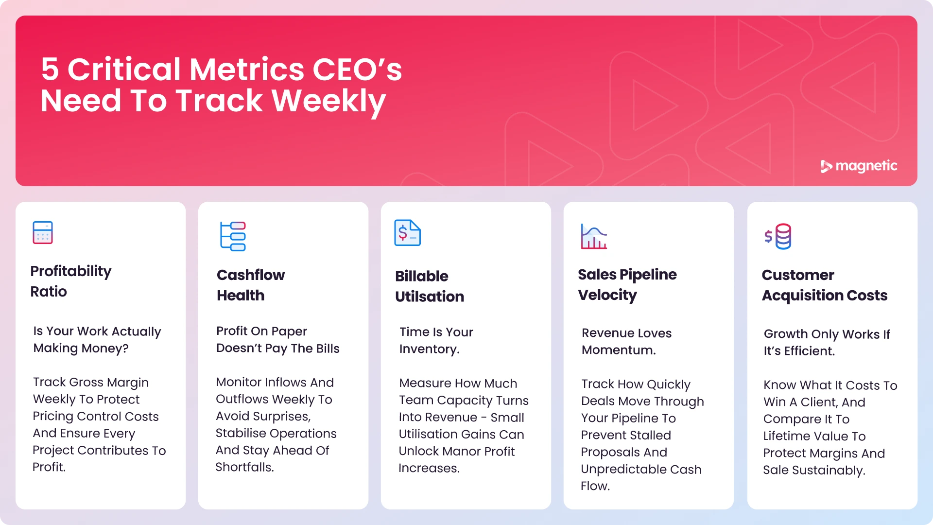
Profitability ratio (gross margin) – Measures how much revenue remains after covering direct costs. | Cash flow health – Tracks whether more money is coming in than going out. | Billable utilisation – Ensures teams are spending enough time on revenue-generating work. | Sales pipeline velocity – Shows how quickly leads move through the sales process. | Client acquisition cost (CAC) – Reveals how much it costs to win a new client compared to their value.
.svg)
Choose the right metrics – Identify the ones most critical to your business. | Set up a dashboard – Use a tool like Magnetic, a spreadsheet, or a finance tracker. | Schedule a fixed time – Hold a 15-minute weekly review to discuss key numbers. Assign accountability – Ensure each metric has a team member responsible for monitoring it. | Look for trends, not just numbers – Focus on changes, patterns, and red flags. | Take action – Use insights to make real-time decisions, not just review history.
Service businesses don’t sell products – they sell time. If too many hours are spent on non-billable work, profitability suffers. Tracking utilisation weekly helps firms ensure their teams are working on client projects rather than admin tasks, maximising revenue without hiring more staff.
Magnetic automates data collection from finance, project management, and sales tools, pulling all key metrics into one dashboard. Features include: Real-time financial insights – No need for manual number-crunching. | Billable time tracking – Integrated timesheets ensure accurate utilisation reporting. | Sales pipeline monitoring – Identifies slow-moving deals before they stall. | Custom alerts and reports – Flags cash flow risks and profitability trends early.
Magnetic – All-in-one business management for service firms. Xero / QuickBooks – For cash flow and financial tracking. HubSpot / Salesforce – CRM tools for monitoring sales pipelines. Google Sheets / Excel – Customisable but manual dashboards. Monday.com / Asana – Project management tools with reporting features.
By tying each metric to a clear decision or action step, not just reviewing numbers. Assign owners to follow up on red flags, set thresholds that trigger responses, and make sure insights feed directly into operational changes or strategic decisions.

Magnetic is an all-in-one workflow management platform designed and built for professional services firms.