Running client projects in 2026 means tighter timelines, distributed teams, and more complex deliverables, all while protecting margins. Yet project overruns at a professional services firm aren’t just operational pain; they eat away at profit and damage client trust within a single billing cycle. That risk is not rare: in Magnetic’s Agency Benchmarking Survey of 104 agencies, 68% reported regularly exceeding project budgets, while only 6% never go over. At the root, most overages stem from poor planning and invisible dependencies, challenges Gantt charts directly address.
Gantt charts have been around for over a century, and they’re still one of the most useful tools for visualising project schedules and coordinating team effort. PM software with Gantt functionality sits in the top five tools used by high-performing project teams (Wellingtone State of Project Management).
What’s changed is the chart itself. Modern Gantt charts sync with resource management systems, update automatically from time tracking, and adapt to a hybrid work reality where more than 60% of project professionals work at least part of the time remotely.
This guide covers how Gantt charts specifically benefit professional services firms, where they fail, and how to set them up so they help your team rather than create another admin job. To understand their impact today, it helps to look at where Gantt charts began.
Henry Gantt introduced his bar chart in the early 20th century as a way to track production schedules in American manufacturing. His version is the one that stuck.
Polish engineer Karol Adamiecki built a similar tool, which he called the “harmonogram”, in the 1890s, about 15 years earlier. Adamiecki’s work stayed largely within Poland, while Gantt’s chart spread through Western industry and eventually carried his name.
The chart itself has gone through several lives. Hand-drawn timelines required complete redrawing for any change. Microsoft Project digitised the format in the 1980s. Today’s cloud platforms add live collaboration, automated dependency updates, and live integration with resource scheduling, time tracking, and finance.
The current shift is AI. Capterra’s most recent project management trends report shows roughly one in five project professionals already using generative AI in over half of their projects. Modern Gantt tools auto-schedule tasks, predict bottlenecks, and revise timelines based on actual team capacity. That eliminates hours of manual replanning.
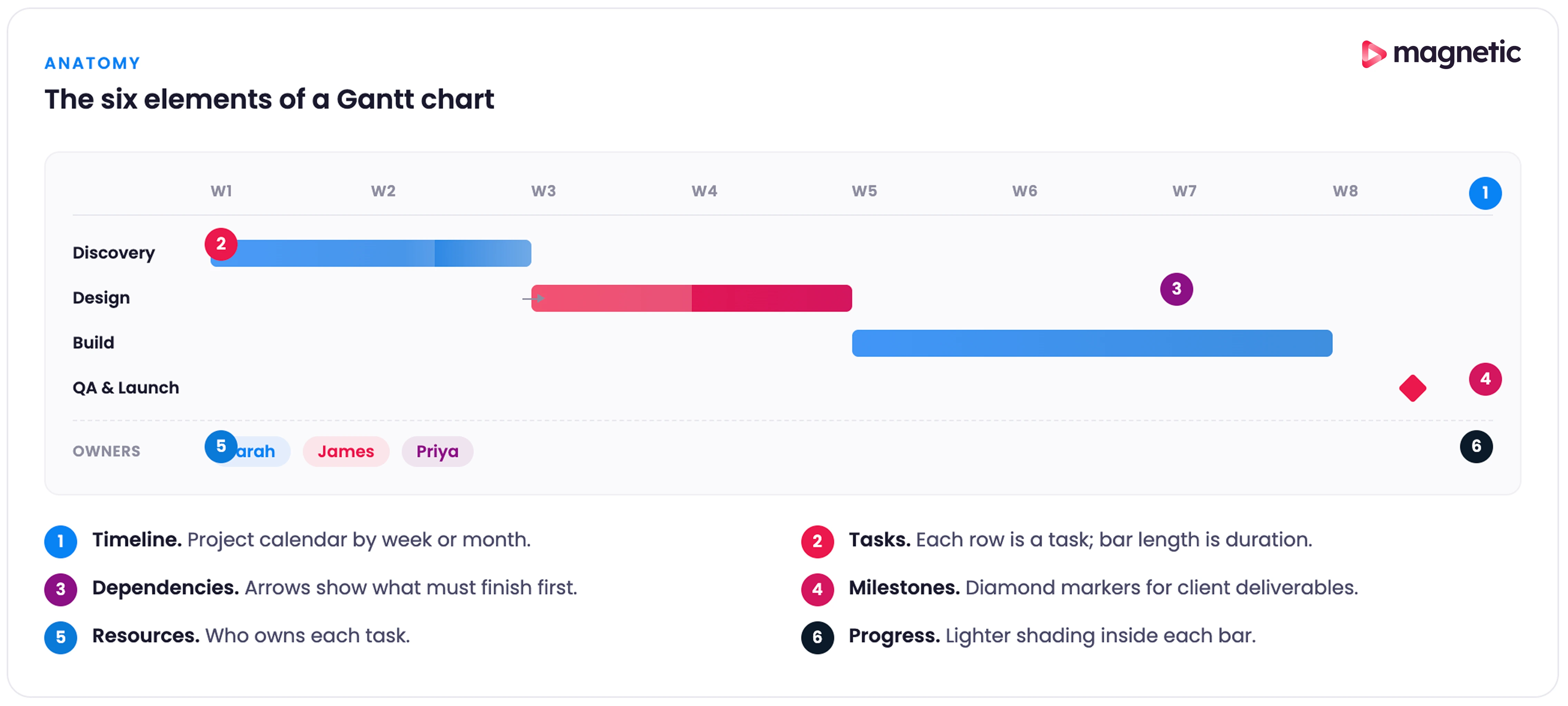
Before getting into benefits, it helps to be precise about what a Gantt chart contains. Most modern Gantt charts have six elements working together.
Timeline (horizontal axis). The project calendar is divided by days, weeks, or months, depending on the project's length. For most agency work, weekly views give the right balance between detail and overview, helping you spot periods of high activity or resource conflict.
Tasks (vertical axis and horizontal bars). Each task appears as both a line item on the left and a bar spanning the timeline. Bar length shows duration; bar position shows start and end dates. In service work, tasks usually represent project phases, client deliverables, or internal milestones, such as creative reviews.
Dependencies. Lines or arrows that show which tasks must finish before others can start. Dependencies reveal your project’s critical path. In client work, they often centre on approval cycles: you can’t launch a campaign until creative is approved, and you can’t develop features until requirements are signed off.
Milestones. Major achievements or decision points are usually shown as diamond symbols. For services firms, these are client presentations, campaign launches, or deliverable submissions. Milestones create natural checkpoints for stakeholder communication.
Resource assignment. The ability to assign team members to assigned tasks. Once integrated with resource management, you see team capacity, utilisation rates, and bottlenecks where key people are overallocated.
Progress evaluation. Task completion percentage that turns a planning document into a live progress tracker. Most platforms colour-code progress so status is visible at a glance.
Here are the eight benefits that matter most to professional services teams, with evidence and caveats.
Building a Gantt chart forces you to break a project into discrete tasks and estimate realistic durations. That structured planning surfaces problems before they become expensive surprises. About 39% of project failures stem from inadequate planning. A well-built Gantt chart attacks that root cause directly.
The agency-specific data backs this up. In our survey of 104 agencies, 37% credited resource management - planning and scheduling - as a top contributor to recent profits, second only to new client acquisition. Resource planning is one of the highest-leverage things a services firm can do, and a Gantt chart is the tool most teams use to actually do it.
For a services firm, the planning benefit goes beyond a single project. When you can see all client work on integrated timelines, you spot resource conflicts early. An account director can see that three campaigns all need creative review in the same week, and adjust schedules or bring in extra capacity before deadlines slip.
There’s a discipline benefit too. Forced specification turns vague commitments into concrete plans. “We’ll get the website done soon” becomes “Homepage design: 3 days, dependent on brand guidelines approval, assigned to Sarah.” That precision is the foundation of every other benefit.
Project teams lose around 60% of their time to “work about work”: meetings, status updates, switching between tools. Gantt charts cut a chunk of that overhead by giving technical and nontechnical stakeholders a shared visual language. A client can read a Gantt timeline without knowing project management methodology.
That visual transparency matters for distributed teams. With most project professionals now working at least part of the week remotely, asynchronous communication holds more significance than ever. A shared Gantt chart lets team members across time zones understand status, upcoming work, and their own responsibilities without waiting for a status meeting.
For client-facing work, transparency creates trust. When clients can see exactly where their project stands, what’s coming next, and how delays in their feedback affect downstream work, the conversation shifts from “Why is this taking so long?” to “What do you require from us to keep this on track?”
For a professional services firm, people are the product. Poor resource allocation not only delays projects but also directly impacts profitability.
A Gantt chart linked to resource management provides a complete picture of team capacity. For example, you might notice one developer has availability next week, while another is overbooked across three projects. This visibility enables better resource allocation, helping you prevent burnout by balancing workloads, reduce overtime by planning ahead, and protect quality by ensuring team members aren’t overextended.
The financial impact is real. When you can forecast resource needs accurately and prevent over-servicing, you protect project margins. Firms that schedule with capacity in mind report better utilisation rates, the metric that separates profitable projects from loss-makers.
A typical scenario makes the value obvious. An agency wins a new engagement starting in two weeks. Without resource visibility, you might assign your best strategist, only to discover they’re already allocated to two other projects in that window. The choice is between overworking your star employee and pulling work at the last minute. A Gantt chart connected to resource management prevents this trap.
Every complex project has a critical path: the sequence of dependent tasks that determines the minimum project duration. Miss a deadline on the critical path, and the entire project gets delayed. Gantt charts make the critical path visible.
For services work, dependencies regularly involve client feedback loops, vendor deliveries, or cross-functional handoffs. A website redesign might depend on brand strategy approval, wireframe design, client review, revisions, development, content migration, testing, and launch. Mapping these dependencies tells you where delays will hurt most and where you have flexibility.
The biggest hidden dependency in service-based work is client response time. In our survey of 104 agencies, 59% said waiting for client feedback was their single biggest bottleneck on client work. Gantt charts that explicitly mark approval gates make that dependency visible to both sides, which is the first step toward shortening it.
This becomes especially important when overseeing multiple client projects with overlapping resources. If the same copywriter is needed for two campaigns, understanding task dependencies helps you sequence work intelligently.
Static project plans become outdated the moment work begins. A modern Gantt chart is a living document that reflects current reality. When team members update task progress, you immediately see which work is on track, what’s falling behind, and how delays flow through dependent tasks.
That visibility creates an early warning system. Rather than discovering problems during a status meeting, you see them forming. A task scheduled to finish on Friday shows only 30% complete by Thursday, signalling the need for intervention before the delay cascades to dependent work.
The data shows how rare this kind of early visibility actually is. In our survey of 104 agencies, 57% had no real-time budget alerts: 22% only found out about an overrun after the budget was already blown, 20% were never notified at all, and 15% only saw it once the project was complete. By the time most agencies see a problem, the margin is already gone. A live Gantt chart connected to time tracking flips that, so the first sign of trouble arrives while there’s still time to fix it.
For services firms managing multiple clients, early detection prevents the worst outcome: surprising clients with missed deadlines. You can communicate proactively when issues arise and maintain client trust even when problems happen.
Projects rarely go exactly as planned. Scope expands, team members get sick, client priorities shift, external dependencies fail. Every change creates knock-on effects through your timeline. Gantt charts let you model these changes before committing to new dates.
Need to pull your lead developer to handle a production emergency? Your Gantt chart instantly shows which projects are affected and by how much. Client wants to add a feature mid-project? You can visualise whether there’s slack in the plan or if the request will push the launch date.
This decision-support capability is especially valuable during the sales process. When a prospect asks, “How long will this take?”, you’re not guessing. You can reference similar projects, build a realistic timeline, and commit to dates backed by actual capacity data rather than hopeful estimates.
Organisations with low project management maturity lose budgets to failed projects 42% of the time (PMI Pulse of the Profession). Gantt charts, used as part of mature PM practices, reduce that waste by making the consequences of decisions visible before you make them.
Long projects without visible progress markers drain team motivation. Gantt charts break work into attainable milestones that create psychological wins along the way. Completing a major phase, getting client approval, or launching a campaign component become moments worth marking rather than another checkbox.
For distributed teams, especially, these visible achievements help maintain momentum. When you’re working remotely and rarely see the finished product, milestone completion gives tangible evidence of progress.
Accountability follows naturally. When teammates can see how their work affects others, peer accountability increases. Knowing that three people are waiting for your deliverable to start their work creates healthy pressure to meet commitments.
The real test of any project management approach is whether it scales. Managing one project with a Gantt chart is easy. Managing five simultaneous client engagements while protecting team sanity needs integrated visibility.
Wellingtone’s research confirms the challenge is real: about 60% of project managers juggle between two and five projects at once, and poor cross-team collaboration ranks as the top barrier to successful project management. Gantt charts that span multiple projects give you the aerial view needed to coordinate across that complexity.
Modern platforms let you view all projects together, filter by client, team, or time period, and spot resource conflicts across your entire portfolio. That multi-project visibility prevents the common services problem where everyone is “busy”, but strategic work gets delayed because day-to-day client demands consume all capacity.
Gantt charts add value when coordination complexity exceeds work complexity. They create unnecessary overhead when applied to the wrong work.
Sequential projects with clear dependencies. Website builds, campaign launches, event planning, and construction. Anywhere task B genuinely cannot start until task A completes; Gantt visualisation pays off.
Projects spanning weeks or months. Very short projects (a few days) don’t need the overhead. Very long projects (multiple years) become unwieldy. The sweet spot is several weeks to several months.
Multi-team coordination. When work involves multiple teams, departments, or external vendors, Gantt charts give the shared reference point everyone needs.
Client-facing projects require transparency. Where clients expect visibility into progress, timelines, and deliverables, Gantt charts communicate project status more effectively than a written status report.
Resource-limited environments. When you’re juggling limited resources across multiple projects (the daily reality for most agencies and consultancies), Gantt charts integrated with resource management become essential.
Highly iterative Agile sprints. Pure Agile teams working in short sprints with constantly shifting priorities often find Gantt charts too rigid. The cost of updating dependencies for work that changes daily outweighs the benefit. Kanban boards or sprint backlogs serve them better. Blended approaches work well: a high-level Gantt chart for project phases, then Kanban for sprint detail.
Reactive or support work. Help desk tickets, customer support requests, bug fixes, and ongoing maintenance. Anything reactive and unpredictable doesn’t fit the Gantt model. These workflows need queue management, not timeline scheduling.
Very simple projects with a few tasks. If your “project” is really three or four tasks one person completes in a few days, a Gantt chart is overkill. A simple checklist suffices.
Exploratory or research work. Early-stage research and discovery phases without defined deliverables don’t map well to Gantt timelines. You don’t know what you’ll discover or how long it will take. These phases benefit more from time-boxing (allocate 2 weeks for discovery) than detailed task scheduling.
Projects where requirements are unknown. You can’t build a realistic Gantt chart without understanding the work required. If you’re still scoping the project, attempting detailed timelines is premature. Define the work first, then schedule it.
The relationship between Gantt charts and Agile has long been contentious. Purist Agile advocates often reject Gantt charts as waterfall relics. Many organisations adopting Agile still need to communicate timelines to clients and stakeholders who think in dates and deliverables.
The reality is more practical. Around 71% of organisations use Agile to some extent (Digital.ai State of Agile Report), and roughly 60% of project managers use hybrid methods. Combining Agile’s iterative execution with structured timeline planning is where Gantt charts find their modern role.
The most effective pattern is to use Gantt charts for high-level project phases and release planning, while managing sprint details with Kanban boards or sprint backlogs.
Here’s how it works in practice.
Portfolio or release level (Gantt chart): Your Gantt chart shows major project phases, release milestones, and external dependencies. For a software project: Discovery (2 weeks), MVP Development Sprints (8 weeks), Beta Testing (2 weeks), Launch Preparation (1 week), Launch. Each phase appears as a single bar on the timeline.
Sprint level (Kanban or backlog): Within each development phase, Agile teams manage work through sprints, backlog prioritisation, and daily standups. The Gantt chart doesn’t show individual user stories; that detail lives in your Agile board.
This separation gives you the best of both worlds. Stakeholders get the visibility into the timeline they need. Agile teams keep the flexibility to reprioritise within sprints.
When you’re using a Gantt chart in an Agile setup, a few principles keep it useful rather than annoying.
Keep it high-level. Show sprints as time blocks, not individual stories. For a project with six two-week sprints, your Gantt might look like this: Sprint 1 (Core Features), Sprint 2 (Integration), Sprint 3 (Polish & Testing). Each sprint is a single bar.
Update after each sprint. Rather than constantly adjusting the chart, update at the end of each sprint based on actual velocity. Sprint 1 took longer than expected? Adjust subsequent dates. Finished early? Pull work forward.
Highlight external dependencies. What makes Gantt charts valuable in Agile settings is their ability to track items outside the team’s control. Client feedback cycles, third-party integrations, approval processes, and infrastructure dependencies. These belong on your Gantt because they affect sprint planning.
Use milestones for demos and reviews. Sprint reviews and demos are perfect Gantt chart milestones. They’re fixed dates for demonstrating progress, and mapping them visually helps coordinate stakeholder availability.
Provide date ranges, not exact dates. Agile embraces uncertainty. Rather than showing “Launch: March 15,” show “Launch: March 10–20.” This acknowledges that, while you’re targeting mid-March, some flexibility is available. It’s more honest and reduces the need for constant chart updates.
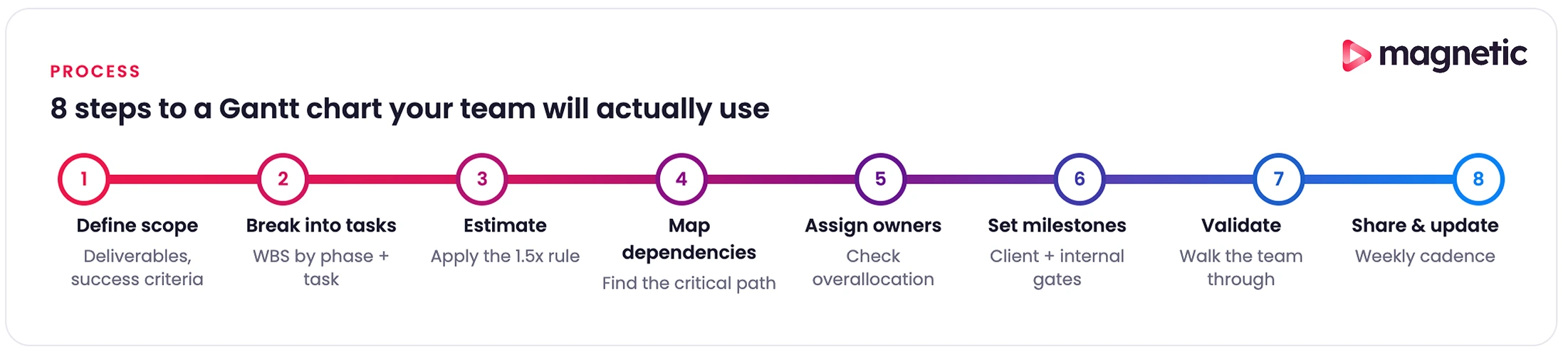
Creating a Gantt chart that helps rather than becomes shelfware takes a bit of discipline. Here’s an eight-step approach for professional services teams.
Before touching any Gantt chart software, get clear on what you’re building. For client projects, that means documenting key deliverables (a website, a marketing campaign, a strategic plan), identifying success criteria for each (client approval? Passing testing? Going live?), and clarifying assumptions and dependencies (what are you assuming the client will provide?).
For an agency managing a brand refresh, deliverables might include: brand strategy document, logo designs, brand guidelines, marketing collateral templates, and website implementation. Each becomes a major section of your Gantt chart.
Decompose each deliverable into the actual tasks required to produce it. Use the work breakdown structure approach: start broad, then get specific.
Phase level: Group related work into phases. For a brand refresh: Discovery, Strategy Development, Visual Identity Design, Guidelines Creation, Asset Production, Implementation.
Task level: Within each phase, list specific tasks. Discovery tasks might include: stakeholder interviews (8 hours), competitive analysis (6 hours), customer surveys (12 hours), and a synthesis workshop (4 hours).
Subtask level (optional): For complex tasks, break down further. “Stakeholder interviews” might be split into: preparing the interview guide, scheduling sessions, conducting interviews, and synthesising findings.
A good rule of thumb for granularity: tasks should be assignable to individuals and be completable within a week. If a task takes longer than a week, break it down. If it takes less than a day, you might be over-complicating.
For services work, also include the often-forgotten tasks: internal reviews, client presentations, revision rounds, approval wait time, and production setup. These overhead tasks consume real time and belong on your schedule.
This is where optimism collides with reality. Poor duration estimates doom projects from the start.
Reference historical data. If you’ve done similar projects before, what did they actually take? Not what they were estimated to take. What did the timesheets show they consumed?
Add a buffer for complexity. New technology, unfamiliar domains, or vague requirements add uncertainty. A brand refresh for a healthcare client involves regulatory considerations you don’t face with consumer brands. Account for learning curves.
Include review cycles. For every client-facing deliverable, assume at least one revision round. Often two. Schedule time for: internal review, client presentation, client feedback, revisions, re-presentation. Our survey of 104 agencies found the median number of revision rounds per project was 5, with a mean of 11, and some respondents reported up to 100. If your timeline assumes one or two rounds, you’re planning for the best case, not the typical one.
Account for approval lag. Clients don’t respond instantly. Build in realistic wait times for feedback. Three business days for minor approvals, a week for major decisions, longer during client holiday periods or budget cycles.
Consult your team. The people doing the work know better than anyone how long it takes. A senior designer might complete a logo exploration in two days; a junior designer might need four. Factor in actual team composition.
Apply the 1.5x rule. Whatever duration you first estimate, multiply by 1.5. This accounts for interruptions, meetings, context switching, and the reality that focused work time is scarcer than calendar time. If a task seems like “two days of work,” schedule three.
Now link tasks in logical order. For each task, ask: “What must be finished before this can start?”
Types of dependencies:
Identify the critical path. Which sequence of dependent tasks determines your minimum project duration? These are the tasks with zero slack: any delay directly pushes the end date. Mark them visually so everyone knows what can’t slip.
Build in parallel work. Not everything needs to happen sequentially. While one designer creates visual concepts, a copywriter can develop messaging frameworks. Identify opportunities to run work in parallel to compress timelines.
Watch for resource dependencies. Even if tasks could theoretically happen simultaneously, they can’t if the same person must do both. Your Gantt chart should reflect real resource restrictions and logical dependencies.
For professional services projects, approval dependencies are critical. Map every point where you need client input or sign-off, and recognise these as points where your team’s forward progress stops until the client acts.
Every task needs a clear owner: the person responsible for its completion. Even if multiple people contribute, one person owns the outcome.
Match skills to tasks. Assign work to people with appropriate expertise. Junior team members are able to perform routine tasks; complex or risky work goes to senior staff.
Look for overallocation. When you assign resources, does anyone end up scheduled beyond their available capacity? If the same developer is assigned to three tasks all happening the same week, you have a problem. Either extend timelines, remove parallel work, or bring in additional resources.
Consider availability. Account for holidays, planned time off, other project commitments, and non-project work (internal meetings, training, administrative tasks). A person with 40 hours of calendar time doesn’t have 40 hours of project time.
Communicate assignments. Creating the Gantt chart isn’t enough. People need to know what’s expected. Share the timeline with assigned individuals, ensure they understand their responsibilities, and provide the context they need to complete the work effectively.
For agencies managing billable resources, this assignment step directly affects profitability. Putting expensive senior people on routine tasks burns the budget. Putting complex client-facing work on junior staff risks quality issues. The Gantt chart makes these resource decisions visible.
Milestones mark major accomplishments and create natural moments for team and stakeholder alignment.
Client-facing milestones: Presentations, deliverable submissions, go-live dates, campaign launches. These are the moments clients care about.
Internal milestones: Phase completions, internal reviews, cross-team handoffs. These keep the team aligned even if clients don’t see them.
Quality gates: Points where work need to meet certain standards before proceeding. Passing testing, design approval, and legal review. Build these explicitly into your timeline.
Schedule routine check-ins. Weekly or biweekly project reviews where you assess progress, identify blockers, and modify plans. These deserve time blocks on your Gantt chart.
Milestones perform psychological and practical functions. They break long projects into achievable chunks, create celebration moments that maintain momentum, and provide early warning when work isn’t progressing as planned. If you miss milestone 1, milestone 5 is almost certainly in jeopardy.
Before committing to the timeline, pressure-test it.
This validation step catches problems while they’re easy to fix. Discovering three weeks into a project that your timeline was impossible wastes time and damages credibility.
A Gantt chart only helps if people use it.
Choose the right sharing level. Clients might see a high-level view showing phases and milestones. Your team sees the detailed task breakdown. Stakeholders receive filtered views that show only what’s relevant to them.
Schedule update cadence. Set expectations for how often the chart will be updated. Weekly updates work for most projects. Daily updates are overkill unless you’re in a crisis.
Track progress honestly. When tasks are complete, mark them done. When they’re running behind, reflect that reality. A Gantt chart that shows everything progressing well when the project is actually failing is worse than useless: it creates false confidence.
Communicate changes. When timelines change, explain why. “Client approval took an extra week, so development now starts March 15 instead of March 8”, maintains trust. Quietly adjusting dates without explanation erodes it.
For professional services firms, the Gantt chart should integrate with your other systems: time tracking (to see actual versus estimated hours), resource management (to maintain capacity visibility), and invoicing (to track progress toward billing milestones). That integration turns the Gantt chart from a standalone planning document into the operational heartbeat of project delivery.
Even experienced project managers fall into predictable traps. Here are the ones we see most often, with the fixes.
The mistake: Creating charts with hundreds of tasks, sub-tasks, and sub-sub-tasks. Breaking every piece of work into 2-hour increments. Tracking points that don’t affect project outcomes.
The impact: Charts become impossible to read and maintain. Team members ignore them because finding relevant information requires scrolling through dozens of irrelevant tasks. The overhead of updating the chart exceeds its value.
The fix: Keep Gantt charts at the right altitude. Show meaningful work units that take days, not hours. If you need task-level detail, use the chart for high-level phases and manage detailed tasks elsewhere. The purpose is coordination and communication, not exhaustive documentation.
The mistake: Creating tasks with start and end dates but no dependency relationships. Treating the Gantt chart like a fancy calendar.
The impact: When tasks shift, nothing updates automatically. Delays don’t cascade properly. The chart shows an impossible schedule where dependent work starts before prerequisites finish.
The fix: Explicitly define relationships between tasks. Use finish-to-start dependencies for sequential work. Let the Gantt chart software manage date calculations based on these dependencies. When you shift one task, all dependent tasks are automatically adjusted.
This is especially important for professional services client work, where approval cycles create hard dependencies. Creative can’t start until the strategy is approved. Development can’t begin until the designs are final.
The mistake: Creating a beautiful initial Gantt chart at project kickoff, then never updating it as work progresses.
The impact: The Gantt chart becomes a fiction, a document showing what you once hoped would happen rather than the current reality. Decisions get made using outdated information. Clients see one status while actual progress diverges.
The fix: Schedule regular update time, weekly for most projects. Use software that lets you make updates quickly (drag-and-drop to adjust dates, click to mark tasks complete). Better yet, integrate your Gantt chart with time tracking so completion percentage updates automatically based on actual effort. The opportunity here is significant: only 33% of agencies track time in real time, with the rest relying on memory at the end of the day or week. When time data is unreliable, the Gantt chart sitting on top of it is unreliable too.
The mistake: Estimating task duration based on ideal conditions: uninterrupted focus time, no revisions, first-time-right execution.
The impact: Projects consistently run late. Team members work unsustainable hours trying to hit impossible deadlines. Client relationships suffer when promised dates slip repeatedly.
The fix: Use historical data. What did similar tasks actually consume on past projects? Build in revision cycles, approval wait times, and review rounds. Apply buffer multipliers (the 1.5x rule). Include non-billable but necessary work, such as meetings, travel, and administrative tasks.
For services firms, also account for client-side delays. Clients don’t respond to questions instantly. Decision-makers aren’t always available. Budget cycles delay approvals. Your timeline must reflect these realities, not fantasy scenarios in which clients react immediately.
The mistake: scheduling multiple tasks for the same person at once, assuming resources scale infinitely, and ignoring people's capacity limits.
The impact: Overallocated team members, burnout, quality degradation, or the project simply can’t execute as planned because people aren’t available.
The fix: Use Gantt chart software with resource management features. Before finalising the timeline, check resource utilisation reports. If someone is scheduled for 60 hours of work in a 40-hour week, you have a problem. Either extend timelines, remove parallel work, or add capacity.
This is especially critical for professional services firms where people are your only real constraint. You can’t manufacture extra designers or developers mid-project. The timeline must fit the available capacity.
The mistake: Creating long Gantt charts loaded with tasks but no clear milestone markers.
The impact: No clear way to assess whether the project is fundamentally on track. No celebration moments to preserve momentum. Stakeholders can’t quickly see progress toward meaningful achievements.
The fix: Identify five to ten key milestones that show considerable progress. Client presentations, phase completions, major deliverable submissions, and go-live dates. Mark these prominently on your Gantt chart. Use them as your primary communication tool for status updates with stakeholders.
For professional services client work, milestones often coincide with payment schedules. Milestone completion triggers invoicing, making accurate tracking doubly important.
The mistake: Treating all tasks as equally important when some tasks (those on the critical path) directly determine the project completion date, while others have slack.
The impact: Teams focus on easy or interesting tasks rather than critical ones. Delays on the critical path surprise stakeholders because the importance wasn’t clear.
The fix: Use software that calculates and indicates the critical path. Communicate to the team which tasks are critical (zero slack: any delay directly pushes the end date) and which have float (some leeway in timing). Focus management attention on keeping critical path tasks on schedule.
This distinction assists with prioritisation. When someone asks, “Should I finish Task A or Task B first?” the answer is usually “whichever is on the critical path.”
Gantt chart fundamentals haven’t changed in a century, but the tools implementing them are transforming rapidly. Capterra’s most recent project management trends report estimates the AI-enabled project management market is growing at roughly 40% CAGR. Most of that innovation is making Gantt charts smarter.
Automated task scheduling. Advanced platforms analyse historical data, team capacity, and task dependencies to auto-generate optimised schedules. You define the work and constraints; the AI proposes the most efficient timeline. That eliminates hours of manual schedule optimisation.
Predictive analytics. AI models analyse project progress and predict likely completion dates based on current velocity. If tasks are consistently taking 20% longer than estimated, AI projects the impact on the end date, giving you an early warning to adjust.
Resource optimisation. AI can analyse resource utilisation across multiple projects and suggest reallocations to balance workloads, minimise bottlenecks, and maximise team capacity. That’s especially valuable for professional services firms overseeing multiple clients.
Risk identification. Machine learning algorithms trained on thousands of projects can flag high-risk tasks: those likely to run over budget or behind schedule based on patterns invisible to humans.
AI won’t replace project management judgment. It increasingly handles the mechanical parts of schedule optimisation, freeing managers to focus on stakeholder relationships, problem-solving, and executive decisions.
Modern Gantt chart platforms operate in the cloud with real-time sync across team members.
For the majority of project professionals working remotely at least part-time, these collaboration features change how distributed teams coordinate without requiring everyone to be online simultaneously.
Standalone Gantt charts are being replaced by integrated platforms that connect scheduling, resource management, time tracking, and finance.
Resource-aware scheduling: Your Gantt chart sees real-time resource availability. It knows that Sarah is on vacation next week, so it won’t auto-schedule work for her. It shows that developers are overallocated in March, surfacing the conflict before it becomes a problem.
Time-tracking integration: As team members log hours, the task completion percentage updates automatically. Actual effort versus estimated effort becomes visible, boosting future estimates and flagging budget concerns early.
Budget and billing integration: Progress on billable milestones triggers invoicing workflows. Cost tracking shows actual spend versus budget in real time. That financial visibility helps services firms protect margins proactively rather than discovering overruns at project end.
Capacity planning: Integrated systems show current projects alongside pipeline opportunities. You can model whether a new business fits existing capacity or requires hiring, which is critical for firms making growth decisions.
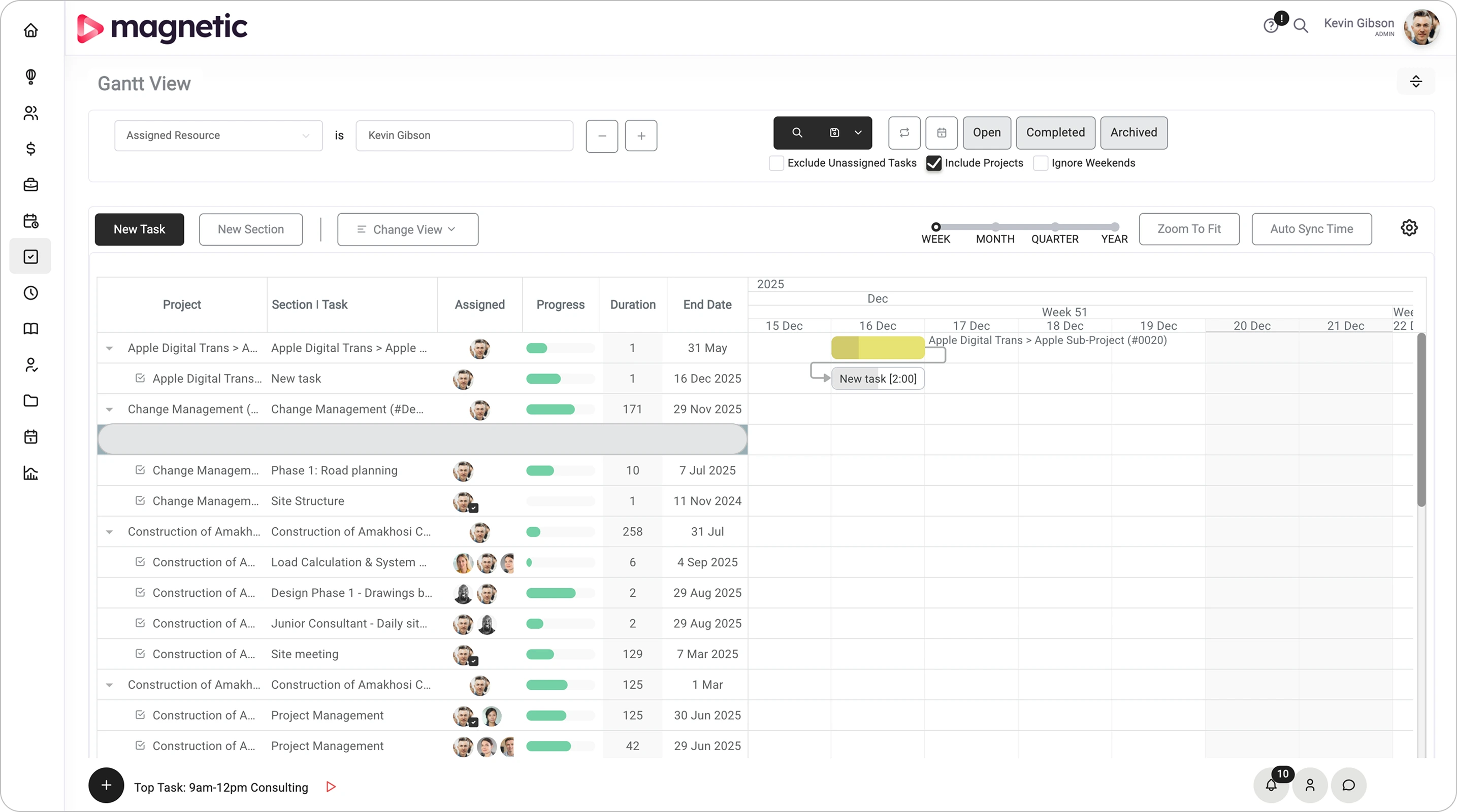
Platforms like Magnetic combine Gantt chart project management with resource scheduling, time tracking, and financial monitoring in one system designed for professional services workflows.
Magnetic’s integrated platform brings together project management, resource scheduling, and financial monitoring specifically for professional services firms. Here’s where Magnetic’s approach differs from generic Gantt tools.
Resource-aware project scheduling. Magnetic connects your project schedule directly to team capacity and availability. When you create a project schedule, Magnetic shows which team members have availability and which are overallocated. That prevents the common services problem of committing to timelines your team can’t deliver.
The resource view updates in real time as you adjust the Gantt chart. Extend a task by a week? Magnetic immediately shows whether those shifts cause resource conflicts, as well as creates new ones.
Profitability-focused timeline management. For agencies and consultancies, project timelines directly influence profitability. Scope creep, inefficient resource allocation, and over-servicing turn promising projects into margin killers.
Magnetic’s Gantt charts integrate with time tracking and budgets, showing whether tasks are on schedule and within budget. When a task estimated at 10 hours shows 15 hours logged and only 60% complete, you see the budget variance forming in time to have proactive conversations with clients about scope.
That kind of integrated visibility addresses a specific gap our Agency Benchmarking Survey surfaced: 30% of agency finance teams said their biggest challenge is simply not knowing which projects and clients are profitable. The Gantt chart isn’t doing the financial analysis, but it’s the surface where the time and budget data become legible to project teams day to day.
Karimjee Group, a corporate in-house creative team, summed up the shift after switching to Magnetic: “Before Magnetic, we lacked visibility into studio operations. Now we can clearly see where time goes, changing how we plan, prioritise, and collaborate.” That’s what a Gantt chart connected to time tracking actually unlocks.
Multi-project portfolio view. Professional services firms rarely manage just one project. Magnetic’s portfolio Gantt view shows all client projects across a unified timeline, revealing resource conflicts, concurrent deadline pressure, and capacity gaps that single-project views miss.
That portfolio perspective helps with key strategic decisions. Do we have the capacity to take on a new client next month? Should we hire an additional designer? Which projects compete for the same resources and need their timelines staggered?
Client transparency and collaboration. Magnetic’s external collaborator invites you to bring clients into a project with restricted access. They see the phases, milestones, and deliverable dates that affect them, without the internal task detail that would only confuse them.
Automation that reduces administrative overhead. One of the biggest barriers to maintaining Gantt charts is the admin burden. Magnetic reduces this through automation:
That automation keeps your Gantt chart up to date without dedicated project administrators manually updating timelines daily. The chart reflects reality because updates happen as a byproduct of doing the work.
Gantt charts have endured for over a century because they solve a fundamental coordination problem: making complex project timelines visible, understandable, and actionable. For professional services firms in 2026, that problem matters more than ever.
The stakes are real. Poor project management costs companies about 10% of every dollar spent. Projects fail roughly 37% of the time due to poor planning. Agencies juggle multiple clients while trying to maintain profitability, protect team capacity, and deliver quality work on time.
Gantt charts, used well, address these challenges directly. They provide the coordination layer that prevents resource conflicts, the communication tool that keeps clients aligned, and the visibility that enables data-driven decisions about timelines, resources, and trade-offs.
The shift is in how Gantt charts are built and maintained. Modern Gantt charts update automatically as work progresses, adjust intelligently when changes occur, and connect to the broader operational systems professional services firms rely on. That removes most of the historical objections about administrative overhead.
The right approach is strategic, not dogmatic. Gantt charts excel at certain kinds of work: sequential projects with clear dependencies, multi-team coordination, and client-facing engagements requiring transparency. They struggle with iterative work, reactive support, and exploratory phases. Choose the right tool for the job.
When you do use Gantt charts, invest in platforms that reduce friction and increase value. Standalone tools that need manual updating quickly become shelfware. Integrated platforms that connect project timelines with resource capacity, time tracking, and financial oversight turn Gantt charts from planning documents into operational command centres. If you’d like to see what that looks like in practice, start a free 14-day trial of Magnetic and run it against your real client projects, no credit card required.
A Gantt chart is a visual project planning tool that displays tasks, timelines, dependencies, and milestones. It helps project managers see what needs to be done, when, and by whom - making it easier to schedule work, track progress, and keep teams aligned throughout the project lifecycle.
.svg)
The key components include tasks (represented by bars), a timeline, dependencies (links between related tasks), milestones, and resource assignments. Together, these elements create a clear, real-time picture of project progress and resource utilisation.
Gantt charts improve planning, communication, and resource management. They make complex projects easier to manage by showing dependencies, setting realistic deadlines, and highlighting potential bottlenecks early- so teams can act before problems escalate.
By sharing a live Gantt chart, every team member can see the project’s status, task owners, and upcoming deadlines. This transparency eliminates confusion, keeps everyone accountable, and ensures that teams and stakeholders stay aligned on priorities.
Avoid overcomplicating the chart with unnecessary detail, ignoring task dependencies, or failing to update progress regularly. Also, ensure realistic deadlines are set—unrealistic schedules often lead to burnout, missed milestones, and inaccurate reporting.
Magnetic’s built-in Gantt chart tool automatically visualises project timelines, dependencies, and workloads in one place. It syncs with your project data, helping you track progress, allocate resources, and adjust plans in real time—all without juggling multiple tools or spreadsheets.

Magnetic is an all-in-one workflow management platform designed and built for professional services firms.